March 2, 2010
Bou Branding
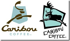
Being a coffee addict, this news is huge for me. Caribou is rebranding itself with a new logo an some drinks/products (I’m in it for the coffee so these ancillary items are inconsequential to me).
The logo change:
Here is the part of marketing/branding that catches my attention:
Alfredo Martel, Caribou’s senior vice president of marketing, said that the new logo focuses on “optimism and an optimistic outlook on life.”
Don’t you love that? That is a pretty heavy analysis of what seems to be a simple logo. I was more intrigued by the fact that the new logo uses a coffee bean for the caribou’s body.
I’ve read some articles commenting that recessions are good times to rebrand your company. I think that is a sound principle. Once I see the new logo hit the street, I will be more likely to stop in and check out the changes. However, $4 coffee drinks best have a solidified hold as a needed “comfort food” to survive the tightening of the American wallet in this recession.


